Home ~
![]()
I use a great many graphics on this site, all of which I have gotten from the internet. In fact, I have spent hundreds of hours surfing for graphics. I have seen a lot of web artists make what I consider to be mistakes, and I offer this advice in an attempt to be helpful. But first, let me explain to the general reader what a "web artist" is.
There are many wonderful individuals who have put their artistic talents to work creating graphics for other people to use on their web pages. By graphics I mean backgrounds (both bordered and tiled – this page has a bordered background), buttons, bullets (such as the ones starting the paragraphs below), and bars, as well as clipart. These artists have sites on the internet from which they distribute their graphics. The graphics are usually free for people to use on their personal home pages in exchange for a link back to the artist's site (thus, such graphics are called "linkware"), and sometimes they are free for non-profit organizations as well; but commercial sites usually have to pay a fee (increasingly, web artists are charging for their graphics). The graphics are copyrighted, and the artist will have posted a list of rules for their use (e.g., do not alter them, do not include them in another collection, do not use them on offensive sites, etc.). Such artists often make little or no money from their graphics, and their efforts are a labor of love more than anything else.
![]() A message about this
site:
A message about this
site:
When I first started collecting graphics, I thoughtlessly downloaded all of them into the same directory, and I ended up with thousands of graphics mixed together. I am still sorting out whose graphics are whose. As a result, I use this system when designing pages: If I know who the artist is, I give a link (if the artist has gone out of business, I give the name without a link). If the graphics do not require a link (e.g., if the graphics came with FrontPage), I insert a black or white leaf at the bottom of the page. If I suspect the graphics require a link, but I don't remember whose they are, I put "[artist?]" at the bottom of the page (with the intention of inserting a link later when I learn who the artist is). If you can help me identify the source of any graphics, please do!
Now for my advice. This article has become somewhat unwieldy as I have added to it over the years, and I apologize if the sections are not well ordered.
![]() Use
the GIF or PNG formats instead of the JPG format.
Use
the GIF or PNG formats instead of the JPG format.
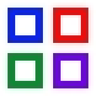
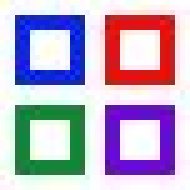
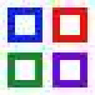
The advantage of the JPG format is that it supports millions of colors, whereas the GIF format supports only 256 colors. However, the JPG format uses a "lossy" compression algorithm which results in distortions when a file is saved. How much distortion is introduced depends on how much compression you use (all graphics programs allow you to control it). Even at the lowest compression, the JPG format introduces visible distortions and, even more worrisome, it changes the colors of your graphics. Here are some examples:
|
GIF
|
JPG – 1% compression
|
|
JPG – 15% compression
|
JPG – 50% compression
|
If you look at the top two examples closely, you will see that there is NO distortion in the GIF, whereas there is visible distortion in the JPG, even at the lowest compression of 1%. The distortion, of course, gets worse as the compression goes up. [Note: I have since learned that JPGs compress the colors in
Here is another example from an actual graphic:

PNG – no compression |

JPG – 1% compression |

GIF – no compression |
I created the three graphics above from a Corel vector graphic, and then I saved it as a PNG, JPG and GIF, using the least possible compression for the JPG. The way the graphic looks on the left is the way it is supposed to look. If you compare the JPG with the PNG, you will see that the colors have changed in the JPG. The JPG substituted darker greens, resulting in heavier striations in the leaves, a heavy outline around the leaves, and slightly darker stems. The turquoise color in the rocks is also darker. The differences may be subtle, but to a discerning eye, they spell the difference between a clean-looking graphic and a muddy graphic. The colors of the GIF are truer, although the stems and other edges are more jagged.
Some people object to the PNG format because the file sizes are larger (without compression, they have to be). However, the difference in size between the PNG and JPG above is small, although the difference would be even greater if more compression were used on the JPG (but then it would look even worse). If you are really concerned about file size, then you can see that the GIF has the smallest file size of all; and even with only 255 colors, it looks better than the JPG. (Please note that the high number of colors in the JPG isn't a good thing – those extra colors are a result of the distortions.)
But does the GIF format have enough colors for your purpose? I think you would be surprised at how many colors 256 are. That's enough for ALL mouse-drawn graphics, and it is enough for many graphics that have gradations of color. Here is another example:
|
|
|
| The original JPG is above (22,774 colors). |
|
|
|
|
| The same JPG reduced to 256 colors and saved as a GIF. It looks the same, doesn't it? |
Basically, only photographs and scanned artwork require thousands of colors. The vast majority of web graphics look fine with 256 colors. (Incidentally, those 256 colors change from one graphic to the next – you can have 256 shades of blue for one graphic and 256 shades of green for another [minus 20 colors which are reserved by Windows]. Also, unlike JPGs, GIFs support transparency, allowing the background to show through.)
The distortions of JPGs become worse as they are opened and re-saved. Below is a sample from a web artist whom I consider to be quite good, except that she uses JPGs (and apparently re-saves them). On the left is a sample from her work; on the right is the same sample cleaned up (by me) to look the way it probably should look. As you can see, the JPG version has many distortions.
|
Enlarged 8 times: |
How that same section would |
|
 |
 |
All of those swirly speckles in the green and blue areas are not supposed to be there.
Here is another example that shows what happens to a JPG when it is repeatedly re-saved. I used 50% compression to make the effect more dramatic.
 |
 |
 |
|
| Original GIF (no compression) |
Saved once as a JPG | Re-saved 10 more times |
If you insist on using a high-color format, then you should use the PNG format, a new format developed for the web by a consortium of companies. It has both millions of colors and transparency, as well as layers and other neat stuff. The file sizes are larger than JPGs, but I don't think that should be an issue. Every day thousands of people are switching from dial-up modems to broadband, and the price of storage space continues to drop. The size of graphics, which was once an issue, should no longer be a concern. Furthermore, many graphics programs (such as Paint Shop Pro 7) allow you to optimize the size of PNGs to get the smallest file size possible.
A new JPG standard was released in 2000. The new JPG format permits files to be saved without any compression at file sizes that are smaller than PNGs. Also, the distortions are less visible when the file is compressed. I am not sure how compatible the new JPG format is with older programs; I am looking into that and will revise this article when I find out.
If you prefer the JPG format, you should keep a master for each graphic in a "non-lossy" format, such as PSP, PNG or TIF, and then, when you are finished working on it, do a Save As to the JPG format. Always work on the master, not on the JPG.
Incidentally, if you can't see the artifacts in the samples above, then you may have an old or poor-quality monitor, or you may be using a resolution of 1024 x 768 or higher (which makes the artifacts harder to see). Below is one more example. I took a GIf, converted it to a JPG with 20% compression, and then blew it up.

The original GIF. |

Saved as a JPG with 20% compression. |
||
The GIF enlarged 5 times. This is |
The compressed JPG enlarged |
Before I move on to the next topic, let me say how amazed I am by the number of web artists who argue with me vehemently about the need to compress their graphics. Keeping their graphics small so that they load quickly is almost an obsession with some artists. If you use a lot of colors, you have a choice: you can either have clear graphics or you can have fast-loading graphics, but not both. Ruining your graphics with compression is like cooking with margarine instead of butter, or painting pictures with cheap paint which will crumble in ten years. If you take pride in your work, you will want it to have quality, and graphics which have visible distortions are not quality graphics.
![]() Name all graphics
starting with the same letters.
Name all graphics
starting with the same letters.
As I stated above, when I first started collecting graphics, I downloaded them all into the same directory. As a result, the graphics of about 15 artists became hopelessly mixed together; and when it came time for me to use them, I couldn't remember which artist had created which graphic. In order to avoid this situation, all web artists should name their graphics starting with their name. All of an artist's graphics will then appear as a group within each user's directory, and the user will be more likely to remember where he/she got the graphics and who should get the credit. Here are some examples:
|
Artist's Name |
Suggested
File Names |
|
Karen S. Nicholas |
KarenSNicholas-brdr07.gif |
|
Little House Graphics |
LittleHouse-brdr06.gif |
|
Pat's Web Graphics |
PatsWebGraphics-brdr19.gif |
Look at the right-hand column in the table above: that is how the graphics will look in users' directories. With the graphics so neatly organized, the user will more likely remember to give you that all-important link. Now that long file names are standard in Windows, there is no reason not to do this.
It isn't a bad idea to go one step further. The first part of the name should be your name or the name of your site, the middle part should be the number of the graphics set, and the last part should be the part name, as follows:
|
Pat's Web Graphics |
PatsWebGraphics-set119-bar.gif (etc.) |
I'm sure you get the idea. You don't have to use numbers for your sets, of course – you can use whatever names you like (Angels1, Angels2, Bears, Bees, Garden1, Garden2, Spring, Fall, Snowflakes, etc.).
Some web artists ask their visitors to create a special directory in which to download graphics, but why leave it up to the visitor to organize your graphics? With proper naming, you can do it yourself.
![]() Don't make buttons, bullets and
link graphics too large.
Don't make buttons, bullets and
link graphics too large.
This is a common mistake. As artists, you naturally want to make everything fancy. But navigational buttons are typically small, and bullets must be small enough not to overwhelm the text which follows them. A good size for buttons is 100 x 35, although I personally prefer 75 x 25. Keep in mind that not everyone who uses your graphics is putting them on their opening home page.
Don't make your link graphic too large. Your link will not be the most important thing on the page, and it should not be so large that it draws attention away from the primary purpose of the page, or clashes with other graphics. The link graphic at the bottom of this page is a good size. Better yet, permit a text link.
![]() Make sets truly complete – include
an Up button.
Make sets truly complete – include
an Up button.
The normal navigational buttons included at the top of a web page are Back, Home, Up and Next – so why do all you artists leave out the Up button??? Also, since everyone's browser has a Back button which behaves differently from the Back button on a web site, you might want to consider including a "Previous" button.
![]() Border images should be continuous.
Border images should be continuous.
The best borders I have seen have an image which appears to be continuous. Borders which repeat a graphic or picture over and over again look hokey, especially if the graphic is surrounded by a frame. That adorable picture of a puppy you have won't look so cute when it is repeated 15 times up and down the page.
An alternative to continuous borders, which are hard to make, is to make borders with several different elements in different positions (such as the one on this page). The changing positions of the elements relieve the monotony. Click here for some examples of good continuous borders that are not hard to "connect" (i.e., to make seamless).
![]() Do not put your name, a logo or
a copyright legend on your work.
Do not put your name, a logo or
a copyright legend on your work.
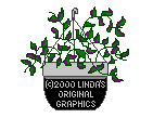
This is a new trend, and it is a very bad one. No designer of web pages who has any integrity will use graphics which have a "brand" on them. Here is an example:
 |
As far as I'm concerned, this graphic might as well look like this:
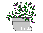 |
Branding your graphics just ruins them, and it will not stop graphics thieves from removing the brand. In this case, there must be a million Lindas in the country, and at least a dozen making web graphics, so putting "Linda" on the graphic doesn't tell anyone who it belongs to.
However, there is one way in which such a mark may be useful, and that is to prove that the graphic is yours. If you mark the graphic with a color that is almost identical to the background color, then you can expose your name by using the flood fill tool. For example, below I created a GIF with the background color #424242 and my name written in the color #424241. My name cannot be seen, yet when I use the flood fill tool (with a tolerance of zero), my name is exposed:
|
The graphic with
|
|
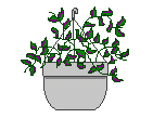
Here is Linda's plant graphic with a hidden message:
|
|
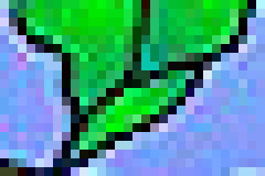
Then I changed it to
|
|
This technique requires that you have at least some solid color in your graphic (and you cannot do this with JPGs). Be careful not to insert the information in any area which is transparent, as the information will then be visible when the graphic is used. Using this technique, you can put a hidden message in your graphics which will not ruin their appearance; and if you also ask your customers to disable right-clicking, then your graphics will be well protected. But putting your name or a copyright legend on your graphics in a readable hue just ruins them. (I have heard of a new identification system that some artists are using, called "Digimarc", but I know nothing about it.)
![]() Don't save the best graphics
for your own site.
Don't save the best graphics
for your own site.
I can't tell you how frustrating it is to go to a site and discover that of the 21 backgrounds there, the only really good one is the one that I can't download and use! If you are capable of making fabulous graphics, make them ALL fabulous. Saving the best for your own site is like a baker who serves the good bread to his family and sells the mediocre bread to his customers. Have some integrity as an artist and put your best into everything you do.
![]() Be original!
Be original!
I understand that not everyone has the same level of talent, and not every
artist can make brilliant graphics, but I see the same things being done over
and over again, especially among "country" artists. Bears, angels, bees,
birdhouses, raggedy Ann dolls, jewels, cherubic children, apple-cheeked
housewives – one gets the feeling
that you are all imitating each other (and looking for an elusive domestic
perfection!). As for backgrounds (which is what I
primarily use), if I see another gingham pattern, I think I will scream!
Flowers, stars, dots, hearts, plaids, ginghams, stripes, paw prints, apples,
autumn leaves, and floating specks or shapes (![]() ,
,
![]() ) have all been done to death. I
have over 200 backgrounds with flowers on my hard drive, and over 50 with
apples, pumpkins, cherries and other fruits, but when I went looking for
a background with wheat or grass on it (for a poem about a farmer looking out over
his fields), I couldn't find one. Web artists need to get away from the
stereotypes and find more interesting, realistic subjects.
) have all been done to death. I
have over 200 backgrounds with flowers on my hard drive, and over 50 with
apples, pumpkins, cherries and other fruits, but when I went looking for
a background with wheat or grass on it (for a poem about a farmer looking out over
his fields), I couldn't find one. Web artists need to get away from the
stereotypes and find more interesting, realistic subjects.
Too many artists use the term "country" as an excuse to draw simple, uninteresting, childish graphics. Objects need to have gradients, and backgrounds need to have interesting patterns and textures. Click on this link to see what one Japanese artist is doing: Little House Graphics (incidentally, Little House puts all of her graphics, no matter how complex, in the GIF format, and they look great). The Japanese are already making better cars; must we allow them to make better graphics too?
![]() Make your site easy to understand and navigate.
Make your site easy to understand and navigate.
This seems obvious, doesn't it? But I can't count the number of times I have closed a site because it was too much trouble to navigate. A common error is to force the visitor to open a new page to look at every graphic (this should be necessary only with sets), or to force the user to navigate through 3, 4 or 5 pages to get to the graphics. Some sites, such as those involved with web rings, have home pages that are so cluttered that a visitor doesn't know what to click on. Those web ring boxes may mean a lot to you, but visitors don't always know what they are. Amazingly, there have been times when I couldn't find a way into a site – I literally could not find the link that would take me beyond the home page!
![]() Don't go overboard on the
rules.
Don't go overboard on the
rules.
Don't expect a link for graphics which are not yours (i.e., which you have gotten from other sites, or which you have made with somebody else's tubes), and don't expect a link for ordinary buttons that anyone can make with the built-in button feature of Paint Shop Pro, Blade Pro or some other program.
If you are selling your graphics (as opposed to giving them away for a link), I don't think you should require a link (although I personally comply with such requirements). I know of an artist who sells her graphics and also demands a link AND a copyright legend!
Don't insist that a set always be used together. Have some faith that people know what they are doing and will use them tastefully. And if they don't, that's their problem, not yours.
Even if your rules are reasonable, don't write them out like a lawyer, or, especially, in a belligerent manner. You will turn people off, and they'll take your graphics without telling you. I understand the frustration you may feel if your graphics have been stolen, but acting angry, defensive and accusatory won't help. If you are going to be possessive about your graphics, you shouldn't be putting them on the Web for everyone to take. There are alternatives – e.g., you can require users to "register" in order to get the graphics. In fact, this last method is very good for insuring that your graphics go onto only good sites.
Don't "reserve" the right to tell people that they must remove your graphics at your request, even if they are obeying your rules. Once a person has gone to the trouble of installing your graphics, it is not fair to ask him or her to remove them just because you had a quarrel (or whatever). It is questionable whether you have such a right anyway. If you are displaying your graphics for the public to take as they please, in so doing you may be giving up your right to tell anybody that they can't use them.
Don't consider every site that has an association with a bookseller to be a commercial site – I have had such an association for two years and have made zero dollars ($0.00) off of it. Another poetry site I know which gets a lot of traffic makes about $25 a year. That's a small pittance compared to the time and expense of maintaining a large site. In the case of this site, I maintain the Amazon association primarily to give poets a link to a bookseller – the prospect of selling a few books is one of the few things I can offer them in lieu of reprint fees, which I can't afford.
![]() Be patient with
people who
bend the rules.
Be patient with
people who
bend the rules.
I am going to relay an experience I had with a web artist, and I'd like to hear from you if you disagree with me. Her borders were too wide for the poem pages on my site, so I altered two of them to show her what I wanted. I e-mailed them to her, asking her permission to use them. Because I had broken her rule not to alter her graphics, she got bent out of shape and withdraw her permission to let me use any of her graphics at all. We ended up quarrelling in e-mails and our relationship ended.
If I had altered the graphics and NOT asked her permission, then I would have understood her anger. It's true that I broke one of her rules, but I did it with honest intentions – and I asked for her permission, which was the important thing. She needed to be more flexible.
The fact is, almost no web artist has the resources to enforce her copyrights. Appealing to a person's hosting company won't help, as hosting companies get involved only when a customer does something truly egregious, such as stealing a home page, stealing an entire site, or stealing an entire graphics collection. Suing is not an option either, because of the expense. Even small claims court is not an option, since you can sue for money damages only, not for remedial action (in other words, a small claims court judge cannot order anyone to take your graphics off his site). And since you are giving your graphics away for free, most judges would consider them to have little monetary value and would award you very little money.
Diplomacy and politeness will accomplish more than threats. In the case above, if she had simply said, "It makes me uncomfortable that you are altering my graphics; I would rather that you describe to me what you want and let me do it", then there would have been no problem. (One of the reasons I did the alterations myself was that she kept telling me how busy she was.)
![]() Don't play politics with your potential customers.
Don't play politics with your potential customers.
So, you don't like what I am saying here? That's not a good reason to refuse to sell me your graphics. I have a right to express my opinions, and a smart businessperson won't hold that against a potential customer. If you are selling your graphics, your only criteria should be whether the customer's site is decent, and whether he or she will follow your rules. Playing politics with people by refusing to sell them your graphics will just make you enemies; and if one of those enemies is in a position to hurt you (by stealing your site or hacking it), then you have created trouble for yourself. Be smart and knock that chip off your shoulder before somebody else does.
(Did you know that site-stealing software is available on the web for as little as $30? Such software is designed to bypass passwords and other security measures. Your entire site, even those pages which are not available through links, can be taken very easily.)
![]() Show a little pride and pay for your own site.
Show a little pride and pay for your own site.
It is not for me to judge how rich or poor anyone is, but if you can afford a computer and Paint Shop Pro, then you can afford to get your own domain name ($20-$35 a year) and to pay a hosting company to host it ($10-$25 a month). As a graphic artist, you must take pride in your work, so why allow your site to be cluttered up with ugly ads just to get free hosting? It looks bad. It looks cheap. I am talking, of course, about the free sites that can be gotten from Geocities, AOL and the like, in exchange for ads that they put on your site. In the same way that you shouldn't ruin your graphics with JPG distortion, you shouldn't ruin your site with ads, especially pop-up ads and pop-down ads (ads which pop down over your pages). (I am not a fan of AOL, but their method is the least offensive: they put a banner at the top of the window with ads and links on it. The banner is separated by a bar and doesn't look like it is part of your site).
Even worse is to have a free site with limited bandwidth in which the hosting company shuts down your site when the bandwidth limit has been reached. Perhaps you haven't seen this. The company gives you, say, 5 MB of bandwidth a month. If that 5 MB is used up by the 22nd of the month, then for the remaining 8 or 9 days, your visitors get a notice that your site is closed. If you have such an arrangement, it is all the more important that you use a registration scheme to reduce your traffic.
![]() Some ideas
for protecting your graphics from theft.
Some ideas
for protecting your graphics from theft.
The best way to protect your graphics from theft is to require users to register before they get the graphics. At the time of registration, the user would have to give you the web address where the graphics would be used, along with a valid e-mail address. You could also require users to have no-right-click scripts on their pages. No-right-click scripts aren't foolproof, but they help.
If you keep your graphics on password-protected pages, you would send the password to the user after registration. Changing passwords on a monthly basis isn't a bad idea. If you don't want to keep your graphics on password-protected pages, you could send out zip files of your sets once the user has registered. In either case, it will be necessary to provide samples of your graphics on your site for visitors to see before they register (the samples should be water-marked or "branded" with your name).
Registration means that you will always know who is getting your graphics, so you can keep an eye on them. If you don't require registration, I can't think of much you can do to prevent your graphics from being stolen (i.e., used without the link-back), or made part of other collections. You can try the Digimarc system mentioned above.
![]() Some ideas
for preventing direct-linking.
Some ideas
for preventing direct-linking.
If you require registration, that will also prevent most cases of direct-linking. Visitors who are responsible enough to register are not likely to direct-link to your graphics. But if you want to give your graphics away freely, without registration, here are some ways to prevent direct-linking:
* Put a no-right-click script on every page containing graphics (note that Internet Explorer 6 requires a special script).
* Periodically change the names of your pages. Doing that will break any links to your graphics.
* Groovy Lizard (www.groovylizard.com) has a neat way to prevent direct-linking: All graphics posted on the pages are branded with Groovy Lizard's names or initials (GL). In order to get the unbranded graphics, visitors must download the zip files. Very few people will direct-link to branded graphics.
Conclusion:
Web artists come and go. That is the lesson I've been learning lately as I go back to favorite sites and find them gone. Web art is a common hobby, something which anyone with artistic talent and computer skills can do. Typically, a web artist will become very involved in the hobby and produce graphics for a year or two. Then the hobby loses its interest and the site may sit there, undeveloped, for a year or more. And then the artist closes the site. If those artists were paid for what they do, I think most of them would continue doing it. Payment for one's efforts is (sadly) confirmation of one's worth. Theft and copyright violation add to the feeling of not being valued.
I don't mean to paint a negative picture of the situation, but this is what I am
seeing. You will do best if you have the right attitude. Protect
yourself from theft, as outlined above. That will keep you from feeling
violated. It is especially important that you not become a martyr
– no one told you to become a web artist.
If you are doing this as a hobby, do it because you enjoy it, not because you
expect any rewards. If money is important to you, then by all means charge
for your graphics (although with all the free graphics floating around, you may
not earn much). Be flexible on the rules –
ultimately, you can't control other people. Finally, be friendly
with the people who use your graphics. Getting into flame wars will hurt
you more than it hurts them.
Bordered background by
![]()